
Twenty five chart types.
One rendering engine.
Every chart on every page draws through the same renderer against the same query layer, so a tile on a dashboard, a panel on a pillar page and a page in a PDF cannot disagree. Build visually, or edit the chart as YAML.
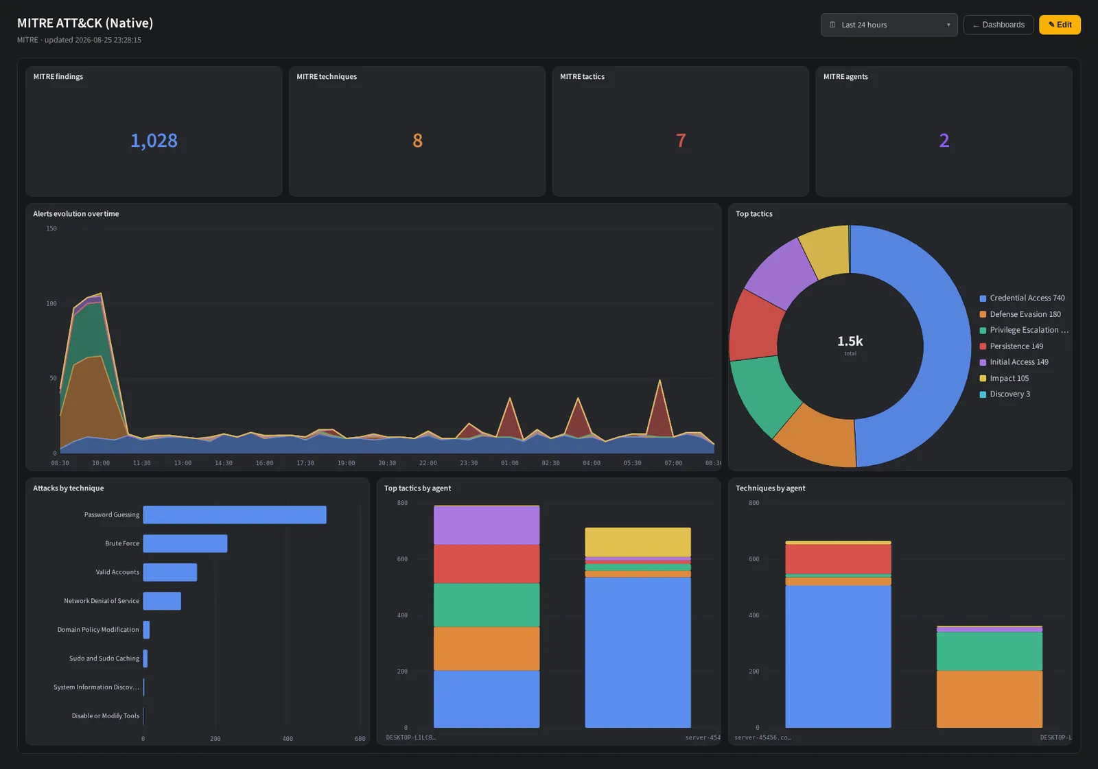
A built dashboard on live data. Tiles are resizable and the range applies to all of them.
The right shape for the question, not just another bar chart.
Security data is not all time series. Attack paths are graphs, technique coverage is a matrix, geography is a map and privilege chains are hierarchies. Every one of these has a first class chart type rather than a bar chart standing in for it.
- ▸Series Line, Area, Bar, Stream for stacked flow over time.
- ▸Proportion and hierarchy Pie, Donut, Treemap, Sunburst, Waffle, Funnel, Radar, RadialBar.
- ▸Matrix and geography Heatmap, Calendar and a country choropleth GeoMap.
- ▸Relationships Tree, Link, Network and Sankey, for attack paths and flows.
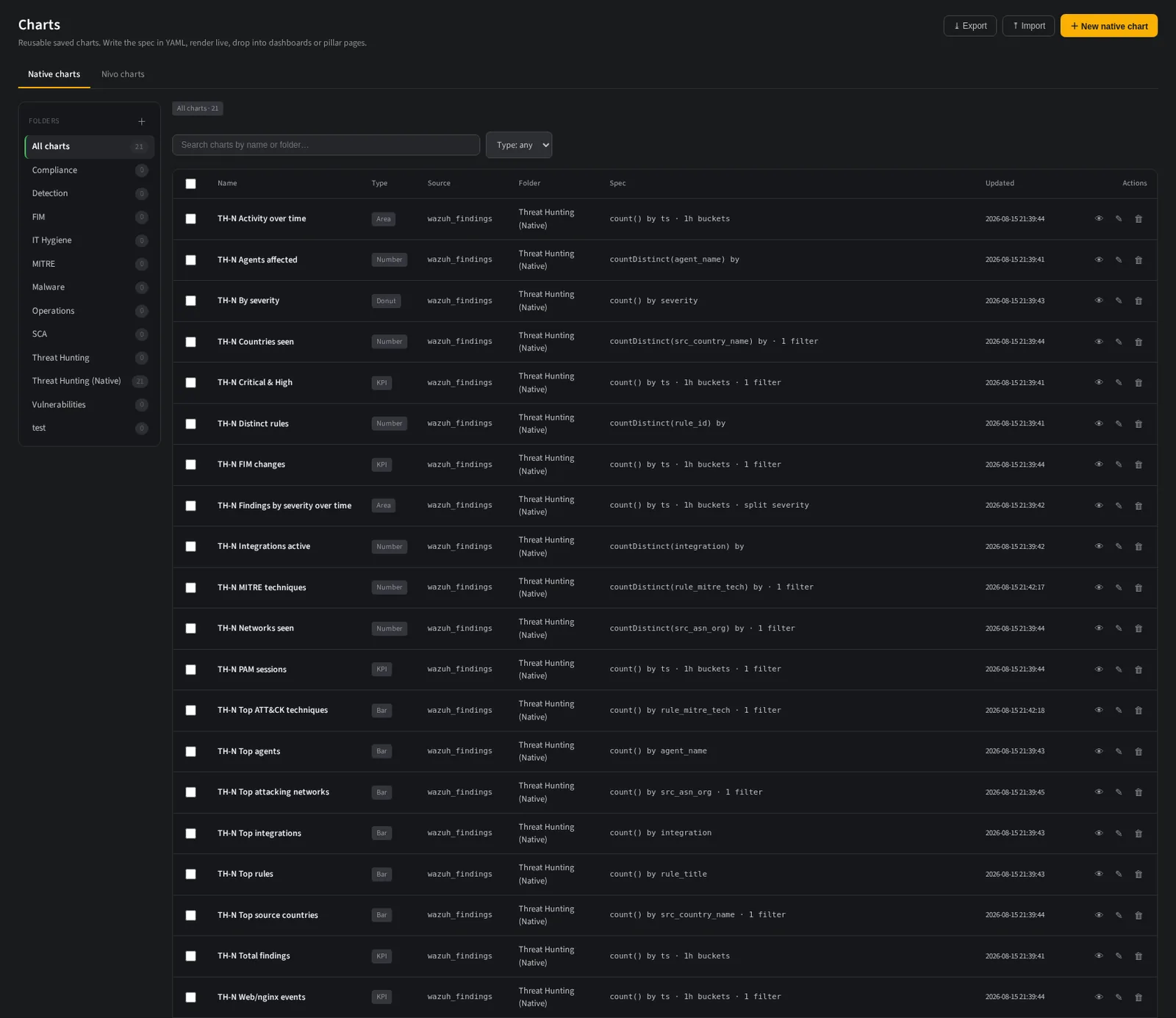
The chart library. Folders group charts by pillar, each card renders live.
Drag, drop, resize. It stays where you put it.
A dashboard is a grid you arrange by hand, with collision handling and vertical compaction so tiles do not overlap or leave holes. Tabs organize a large dashboard, and a tab can hold a group of sub tabs when one subject needs several views.
- ▸Tabs and sub tab groups nest one level, which is enough for a framework view without becoming a maze.
- ▸Deep linkable. The active tab and sub tab live in the URL, so a link opens the exact view you meant.
- ▸One time range and one agent scope apply across every tile, and survive a tab switch.
- ▸Scalar tiles scale. A number tile resizes its own type to the tile, instead of clipping.
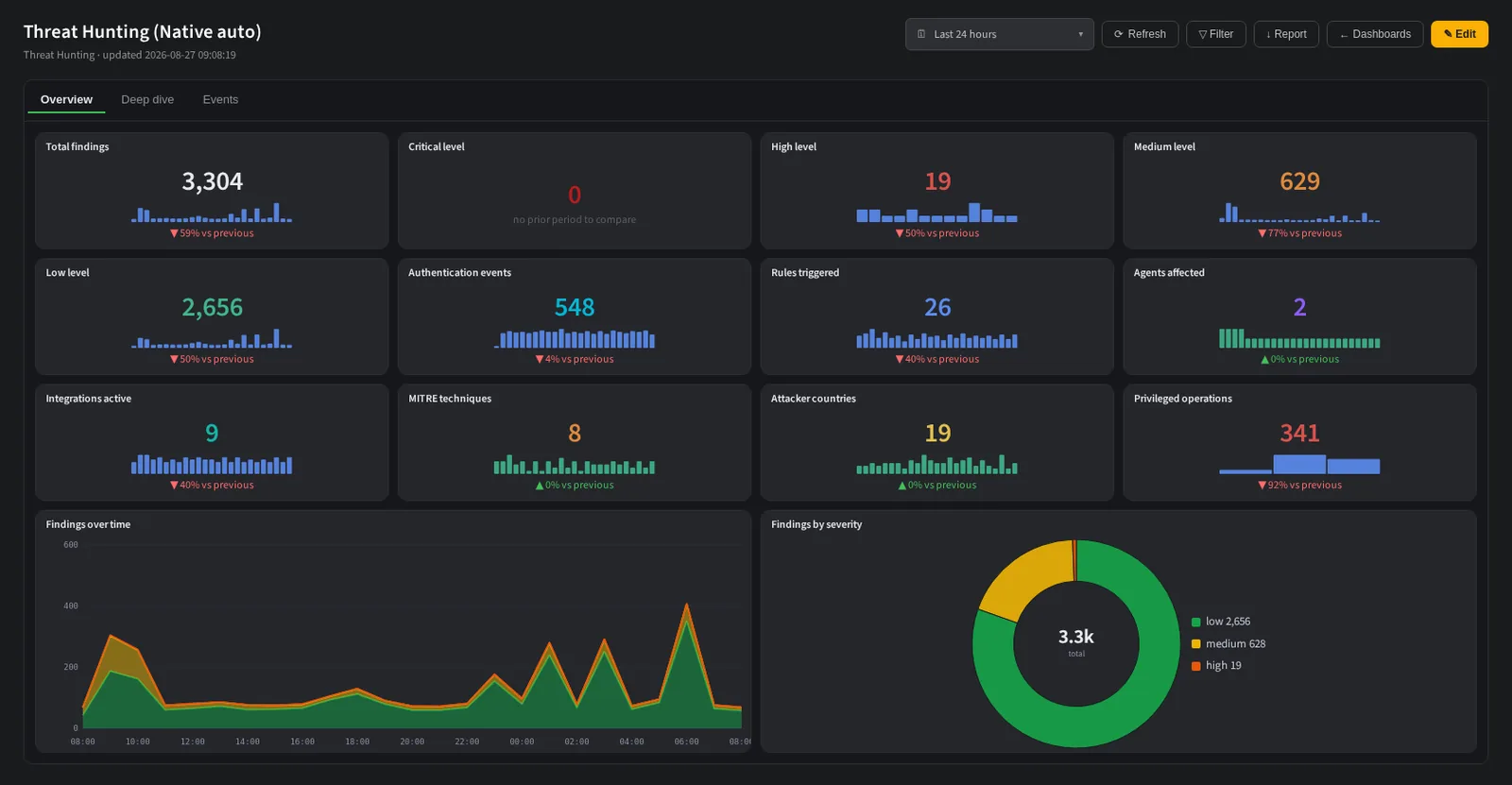
Tabs across the top, tiles below. Resize a tile and its content scales.
A chart you can diff, review and copy.
Every chart has a YAML representation with the same editor the rules use: line numbers, per token highlighting and per key autocomplete from the live field catalog. Copying a chart between environments is copying a file.
- ▸Source, metric, dimension and split are four keys, not a query builder you fight.
- ▸Filters use the shared operator registry, so a chart filter reads like a detection condition.
- ▸
splitBymakes it stacked. One key turns a line into a stacked severity band or a per agent stream. - ▸Options are explicit. Palette, target, maximum and axis behaviour are keys in the file, not hidden defaults.
The same chart, as a file. Autocomplete offers real fields from the live catalog.
A dashboard is already a report.
Any dashboard you built exports through the same pipeline as the built in report templates. PDF gives the summary, one page group per tab. Excel gives the data behind every chart, one sheet per tab. Nothing is rebuilt by hand and nothing can drift.
- ▸Every tile is covered. Series, scalar, table, geographic and graph tiles each map to a real report primitive.
- ▸Graph tiles become flow tables with source, target and weight, so a Sankey survives the trip to paper.
- ▸Row limits are a setting. PDF is a summary and defaults to 25 rows, Excel is the data and defaults to 100.
- ▸Event tables are deduplicated and ordered by severity, so the same alert firing five hundred times is one row.
Bring the dashboard you rebuild
by hand every month.
Show us the board you screenshot into a slide deck. We will build it on live data and schedule it as a PDF and an Excel workbook.
Powered by Codesecure Solutions. Self hosted, cloud or fully managed.